Back Home

Data visualisation settings

Overview

Users are having difficulty interpreting the data in our tabular reports because the formatting options are not available. Making it difficult to view data in the way that makes the most sense for the user's needs. Relaying on other apps to demonstrate the data in tables, This is causing frustration and wasted time for our users .
My Role
Lead Product Designer
Teammates
PO/PM
Engineering
Duration
3 Months
Aug 2023 - Nov 2023
Tools
Figma
Google suite

The Problem

Business Problem

It require enhancement to keep parity with, and provide differentiators from competitors. Increased customer reliance on third party tools for reporting. 

UX Problem

Users are having difficulty interpreting the data in our tabular reports because the formatting options are not available. Making it difficult to view data in the way that makes the most sense for the user's needs. Relaying on other apps to demonstrate the data in tables, This is causing frustration and wasted time for our users.

The Process

User Interviews

I have conducted user interviews to uncover pain points that users were experiencing with the current report builder feature.

Key Findings

Data is sourced from different sources like Forecast, Xactly, and financial metrics for creating executive reports. However, the resulting reports lack proper formatting, which makes them difficult to view and segregate.
The desired formatting options include highlighting totals, using double lines, bolding and highlighting text, adding color, and highlighting specific columns.
The customer has requested further customization options, such as font size, color, style, alignment, and fill color for the widget and field names, in addition to the main body.
Other customers have also inquired about left-to-right alignment. The customer recommends using a monospaced font for improved clarity and readability, ensuring that digits and commas align vertically for quick and easy information retrieval.
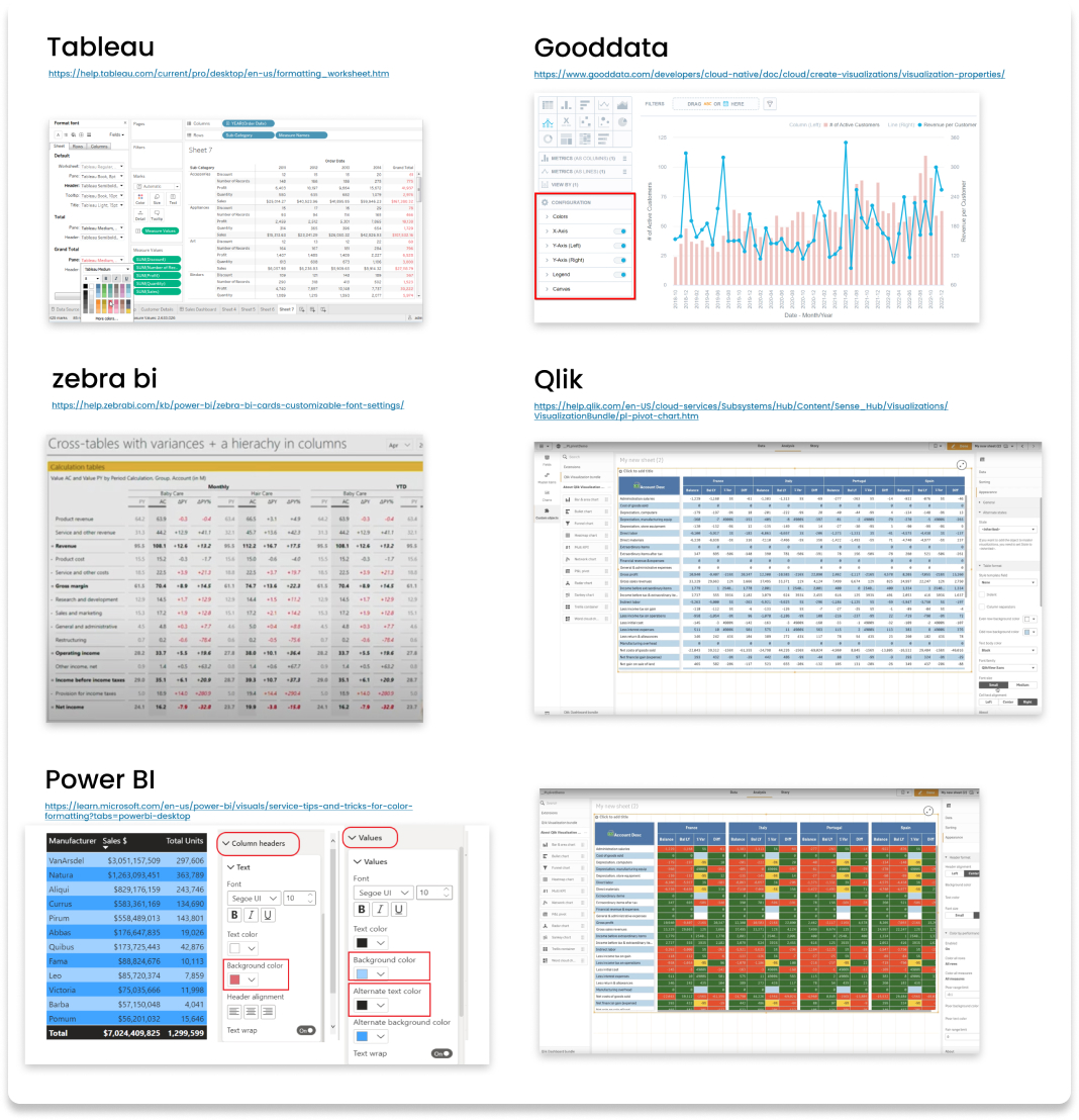
A similar level of customization to Excel, Tableau, and Zebra BI perspective is necessary to achieve these goals.
Additionally, a method has been implemented using Microsoft Teams during meetings to draw boxes around specific data points and pinpoint them for emphasis.
Competitive Analysis

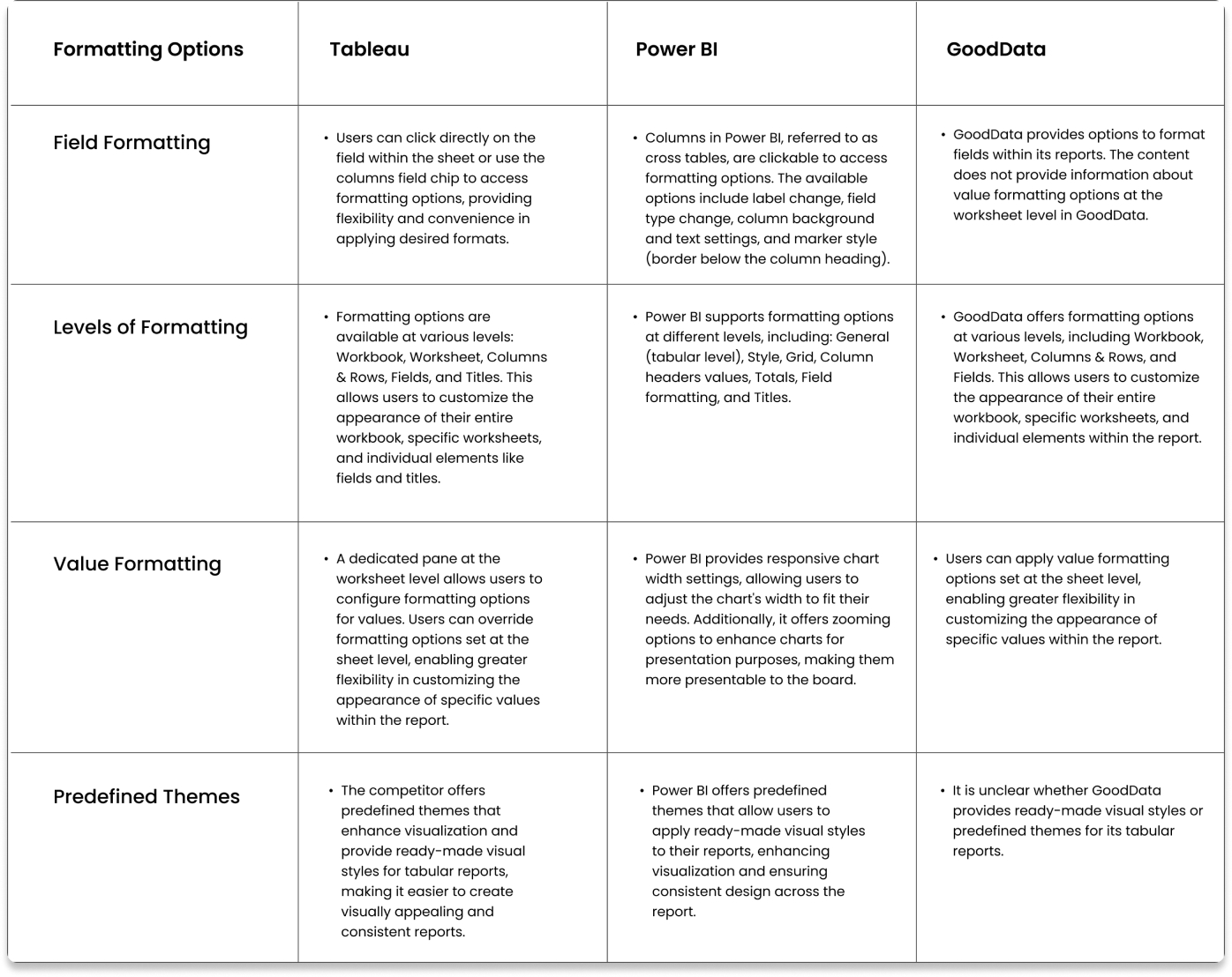
For this analysis, we have selected three leading products in data management and visualization. The analysis focused more visualization features on possible data types, customization options.

Persona

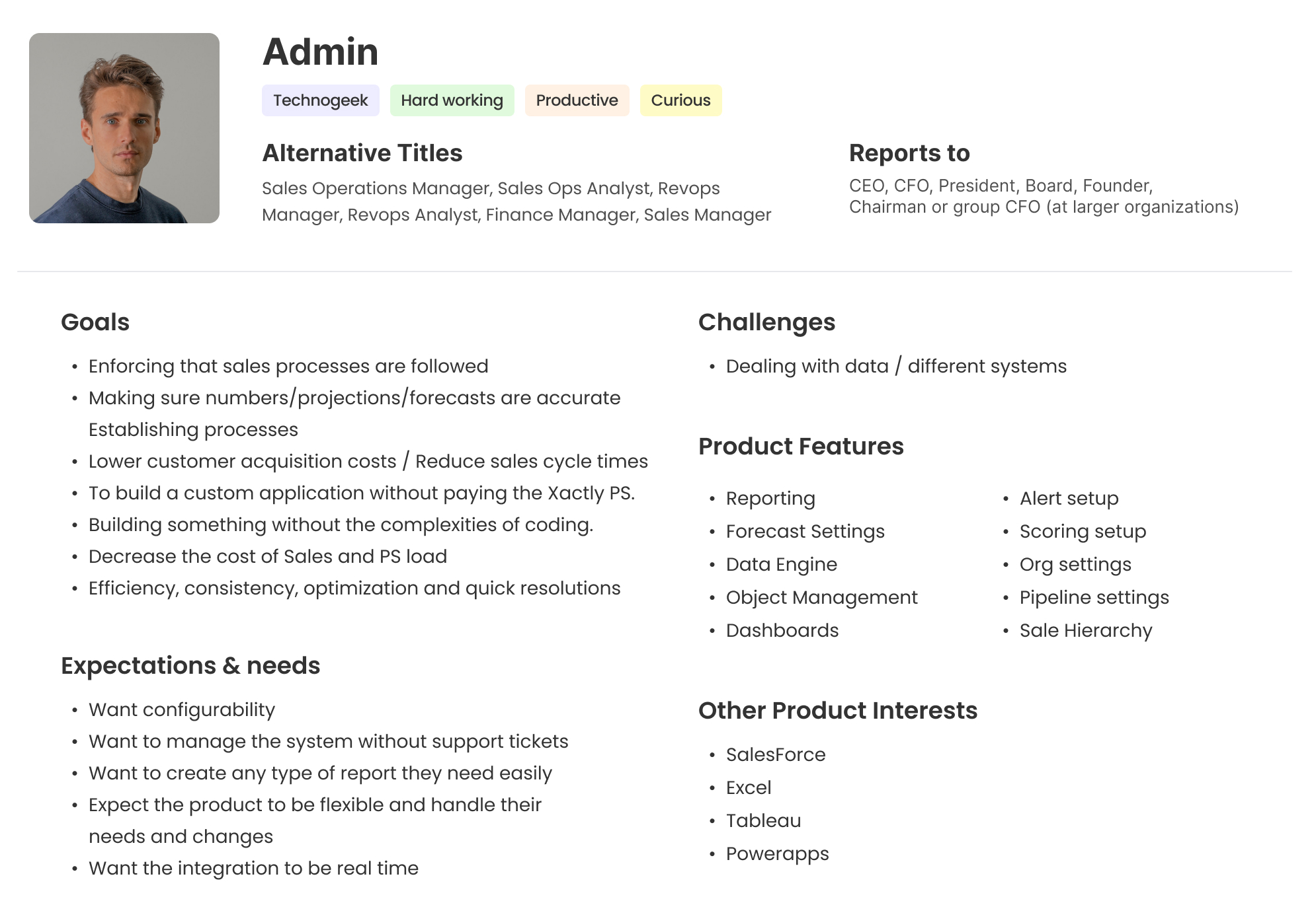
I have Interacted with various product experts and collected the data on user goals, expectations and challenges. By creating a persona based on my research findings, I was able to gain a deeper understanding of our target audience and their needs and preferences

Defining Flow & Requirements

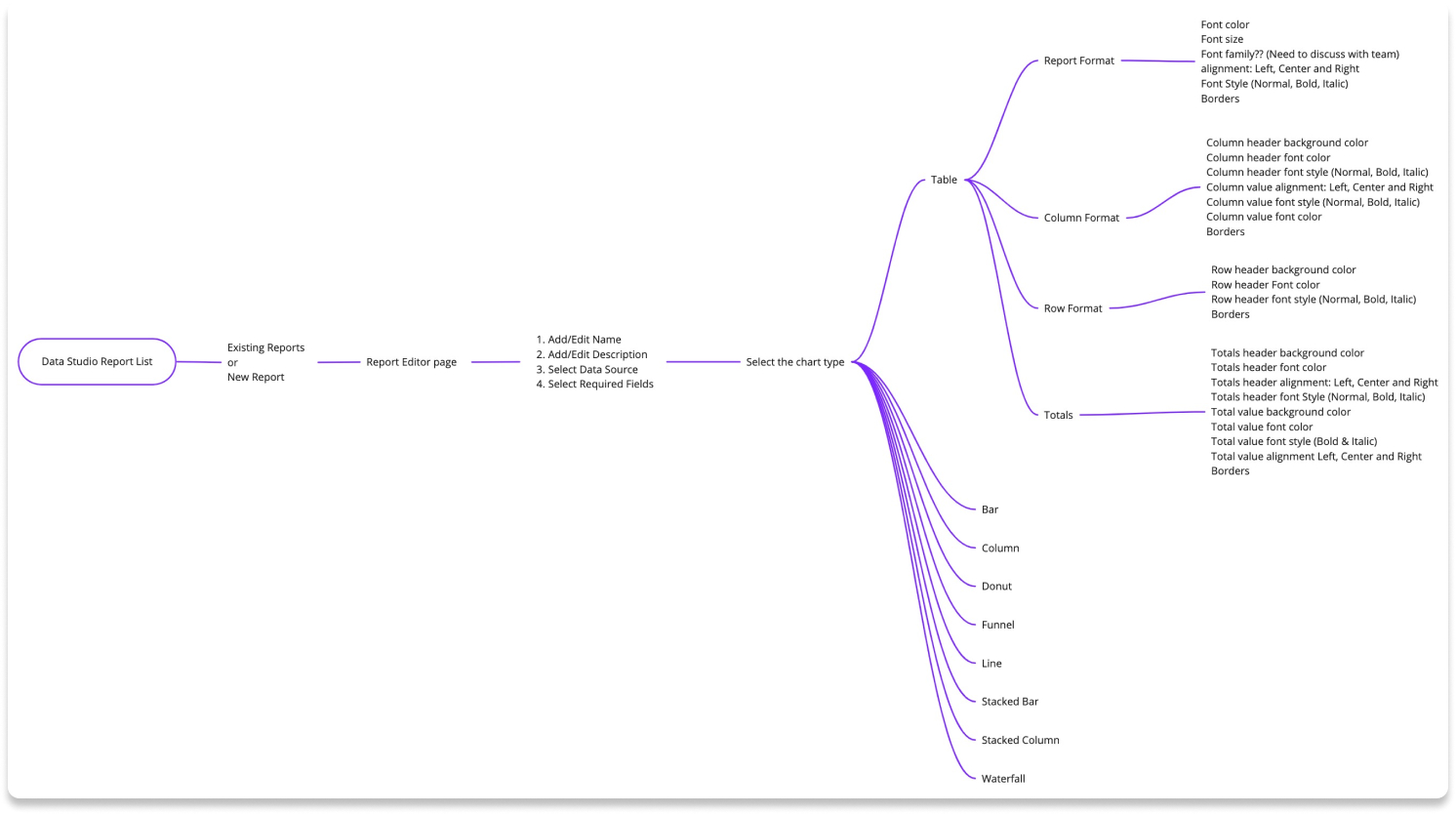
Based on the user feedback and industry research we had a workshop and finalized requirements for the tabular report formatting as follows.

Defining Hierarchy

Design Concepts

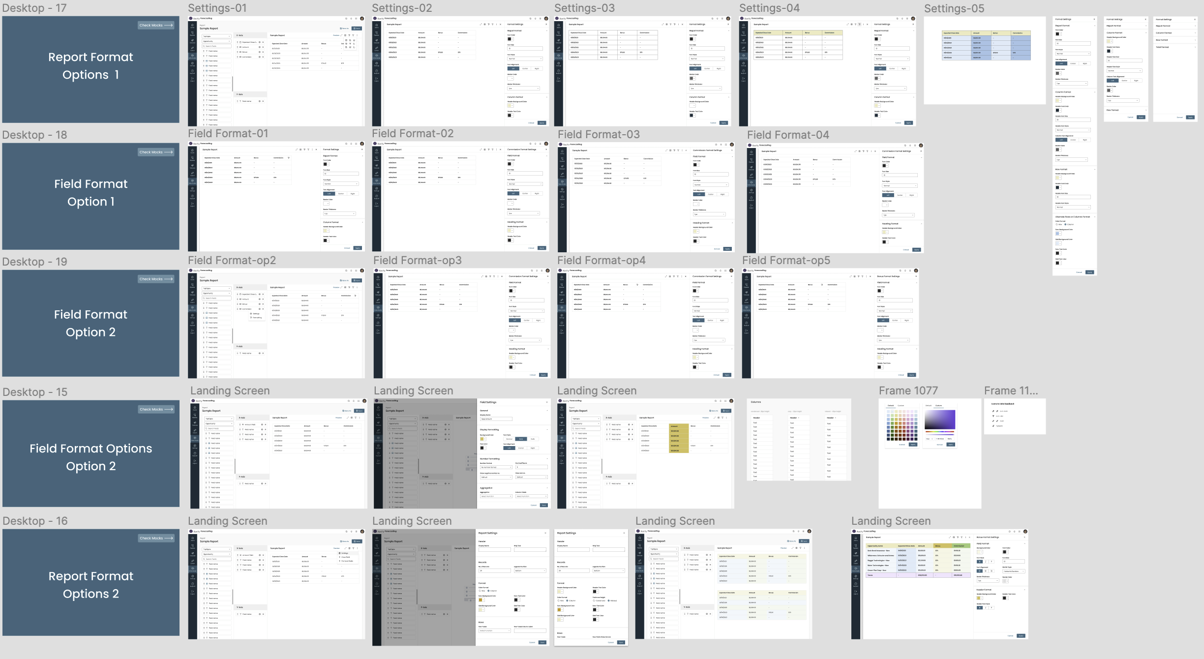
I have devised multiple solutions to tackle the problem, taking into account various aspects of the product. I have facilitated design critique meetings with the Design team, Project Managers, and Engineering team to gather valuable feedback and insights.

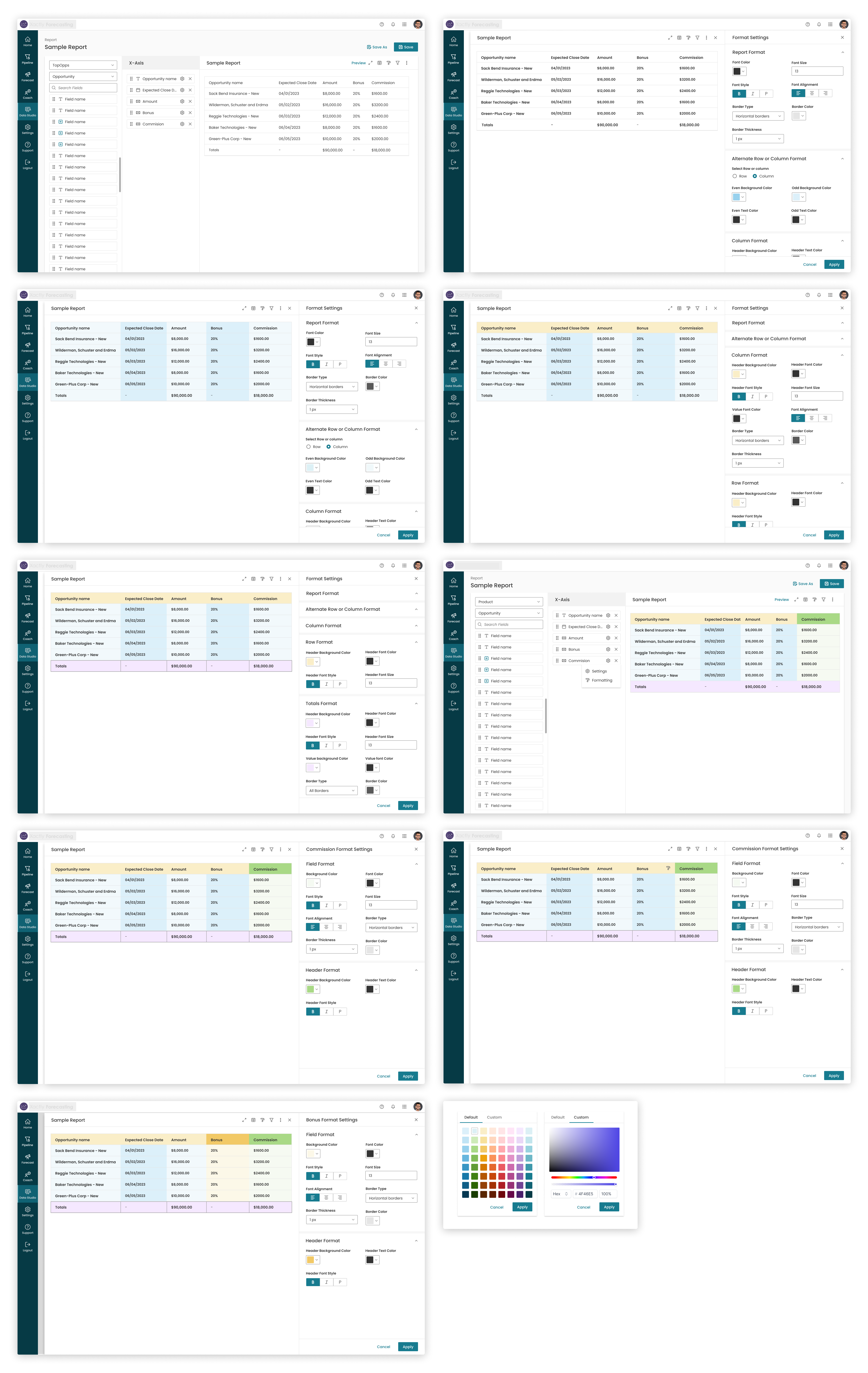
Final Designs & Prototype

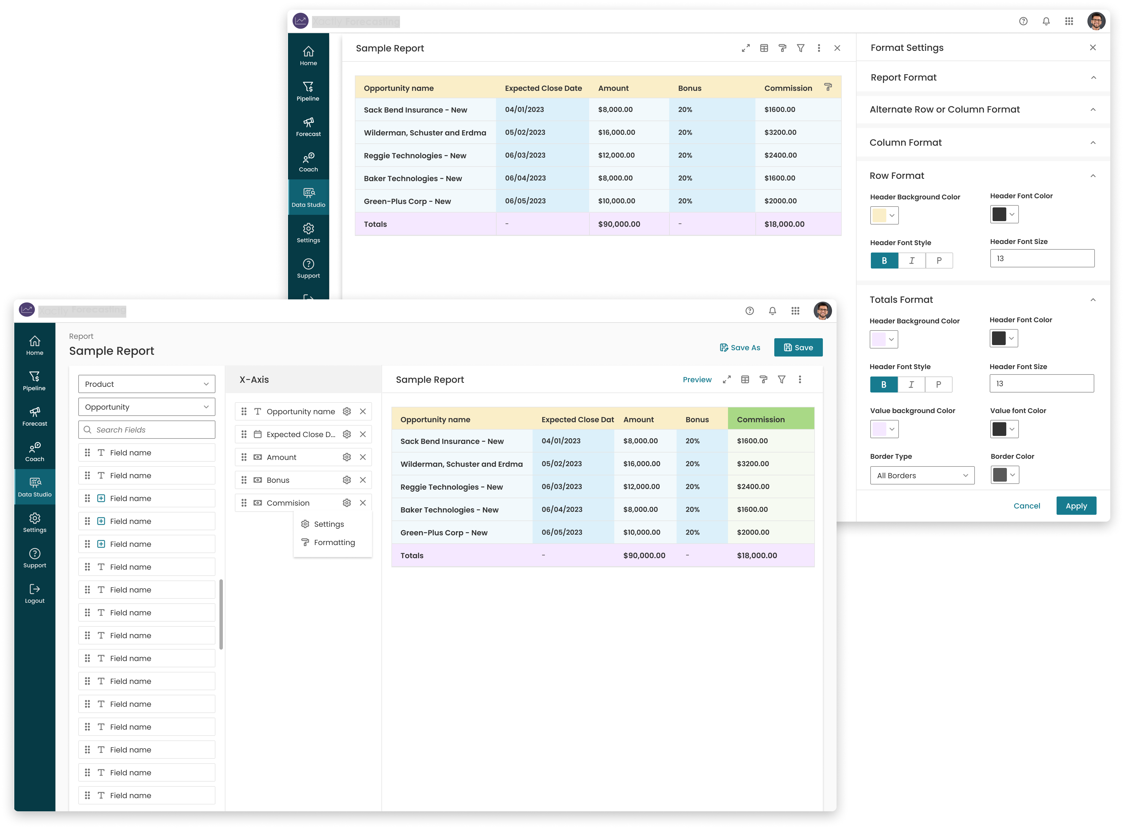
To validate the designs, I conducted user testing sessions. Before that, I facilitated a review session with the PM and Engineering teams to align everyone on the requirements and designs. This allowed us to address any potential technical challenges and ensure a cohesive understanding before presenting the designs to the customers for their review.

Validation

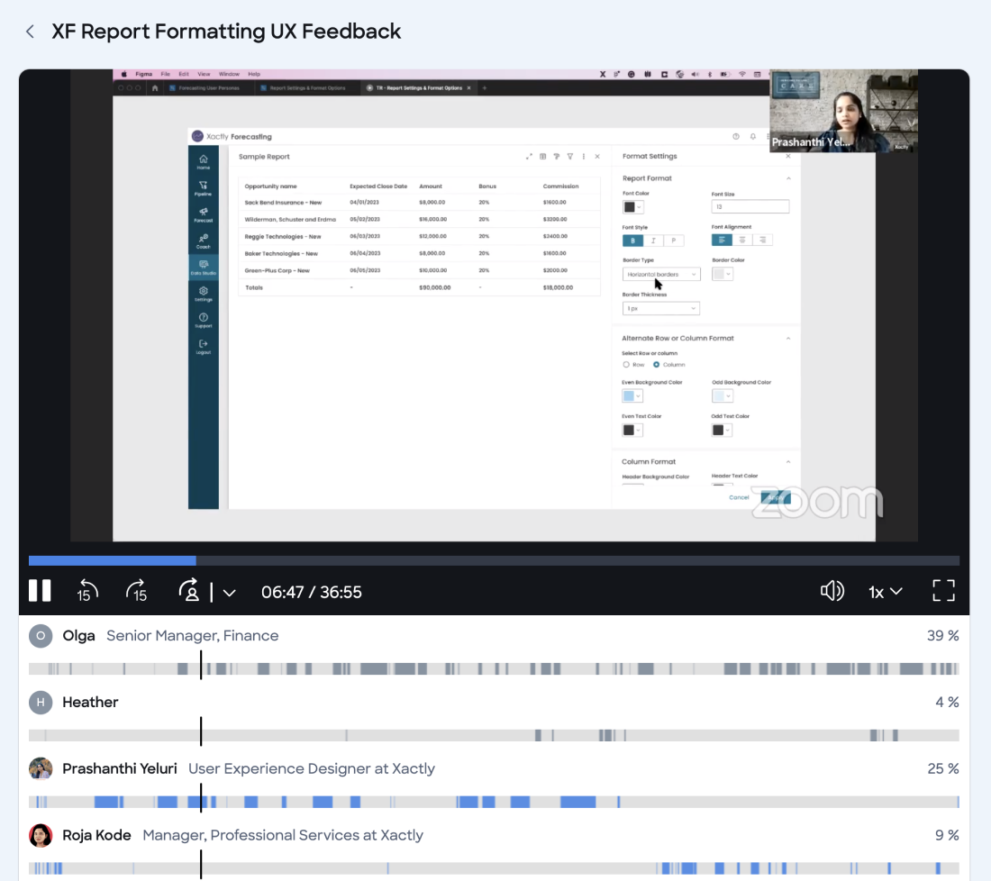
I collaborated with PM and Support team to validate the designs and collected feedback from customers who has requested the feature to ensure their effectiveness.
2
Stakeholders
4
Users
2
Suppor Team
2
Marketing Team
Liked showing the format options on maximized window.
Loved the way of clicking on field to configure field level formatting.
All levels of formatting makes sense for them and asked to provide row/column total formatting.
Loved the color pallet proposal with default colors and custom colors.
Want to save the settings as a them so that they can utilize it for other reports.
No concerns on Formatting hierarchy.

Developed Project

I worked very closely with the Front End team and conducted a UX review of each front-end ticket that was implemented to ensure it was aligned with the designs before it went live. You can see the final developed project below.

Success Metrics

In Progress

Check Out Next Project

Redefining Analytics Colors

Read Case Study