Back Home

Redesigning The Legacy Sales Pipeline

Overview

The "Pipeline management" project aims to improve the ability of salespeople to manage their prospects and deals across various stages of the sales cycle. The project involves creating a visual representation of the sales process and providing a 360-degree view of prospects to sales leaders and reps.

The current user adoption rate of the pipeline feature is low due to outdated UX/UI and legacy technology that causes delays in updating data. To address this issue, we have prioritized the pipeline feature to revamp first as part of a product overhaul. The goal is to enhance the user experience and improve data accuracy, which will increase user adoption of the feature.
My Role
Lead Product Designer
Teammates
Engineering
PO
Duration
3 Months
Jan 2022 - March 2022
Tools
Figma
Google suite

The Problem

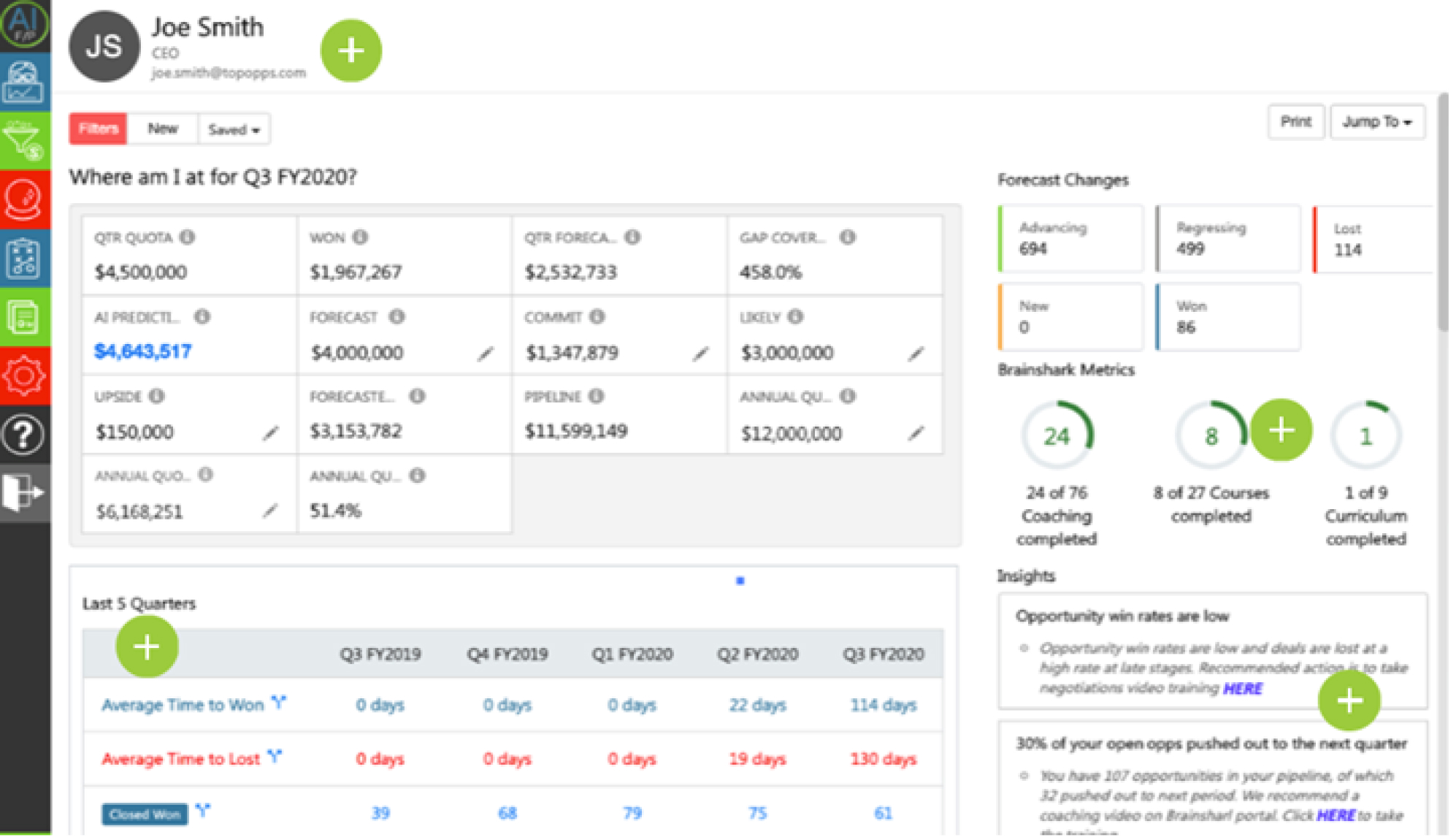
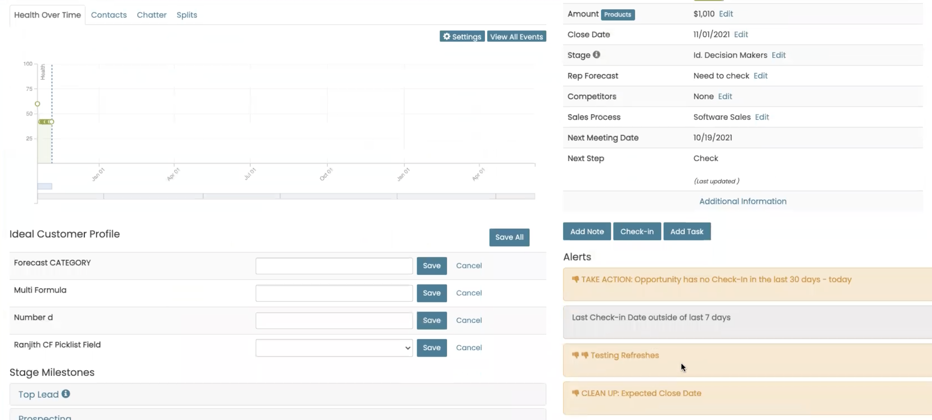
The current sales forecasting pipeline has several UX issues that hinder the accuracy and efficiency of the forecasting process. The system lacks a user-friendly interface and does not provide an intuitive workflow for sales teams to input data, visualize forecasts, and make informed decisions. As a result, sales reps struggle to use the tool effectively, leading to inaccurate forecasts, missed opportunities, and lost revenue.

Business Problem

Pipeline is not effective in attracting and retaining users, which resulting in low sales and revenue. Negatively impacting sales and leading to poor customer satisfaction and brand reputation.

Visitors-90 days

328

Average Time-User/Day

1m 30s

Accounts

30

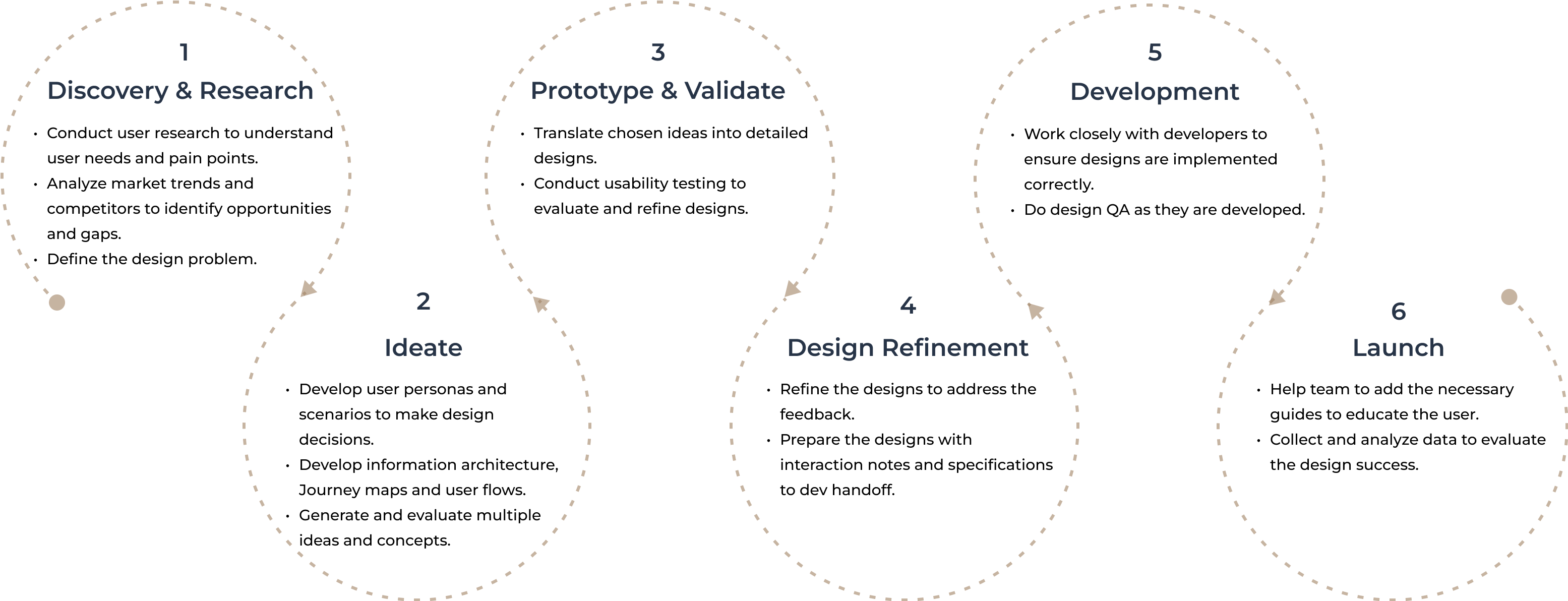
The Process

Qualitative Research

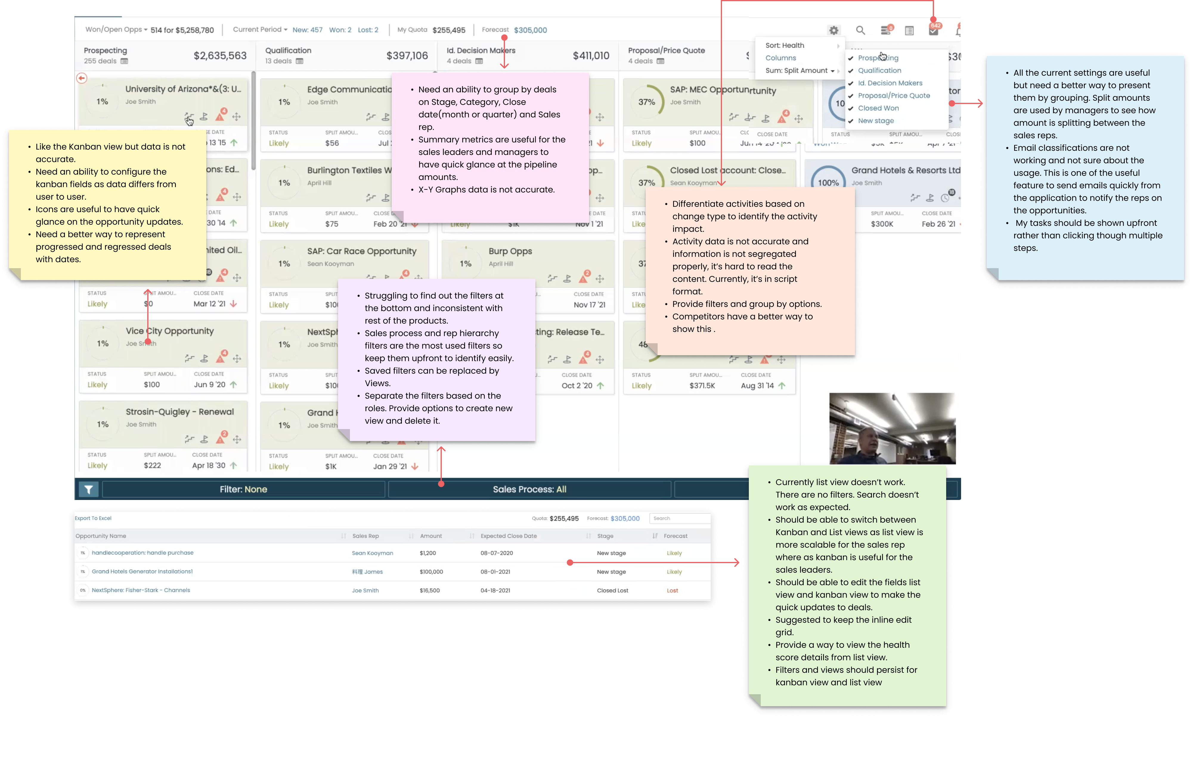
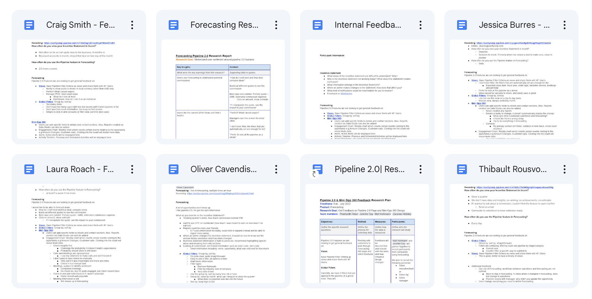
I conducted user interviews to identify pain points that users were experiencing with the current pipeline feature. This allowed me to gather valuable insights that informed the design of a more user-friendly.
2
Stakeholders
4
Users
2
Supporting Team
2
Marketing Team

Key Findings

Users are not engaging with list view, analytics, tasks, email and Alert features of the page, indicating a lack of interest or relevance in those features.
Have difficulty understanding Filters, sales process and views on the application, indicating a need for improved clarity and organization of information.
Encountering errors when updating or editing the opportunity, leading to frustration and decreased trust in the system.
Spending too much time navigating to the Opportunity details, resulting in a low task completion rate and high frustration levels.
Page looks too busy and struggling to find the important deals information.

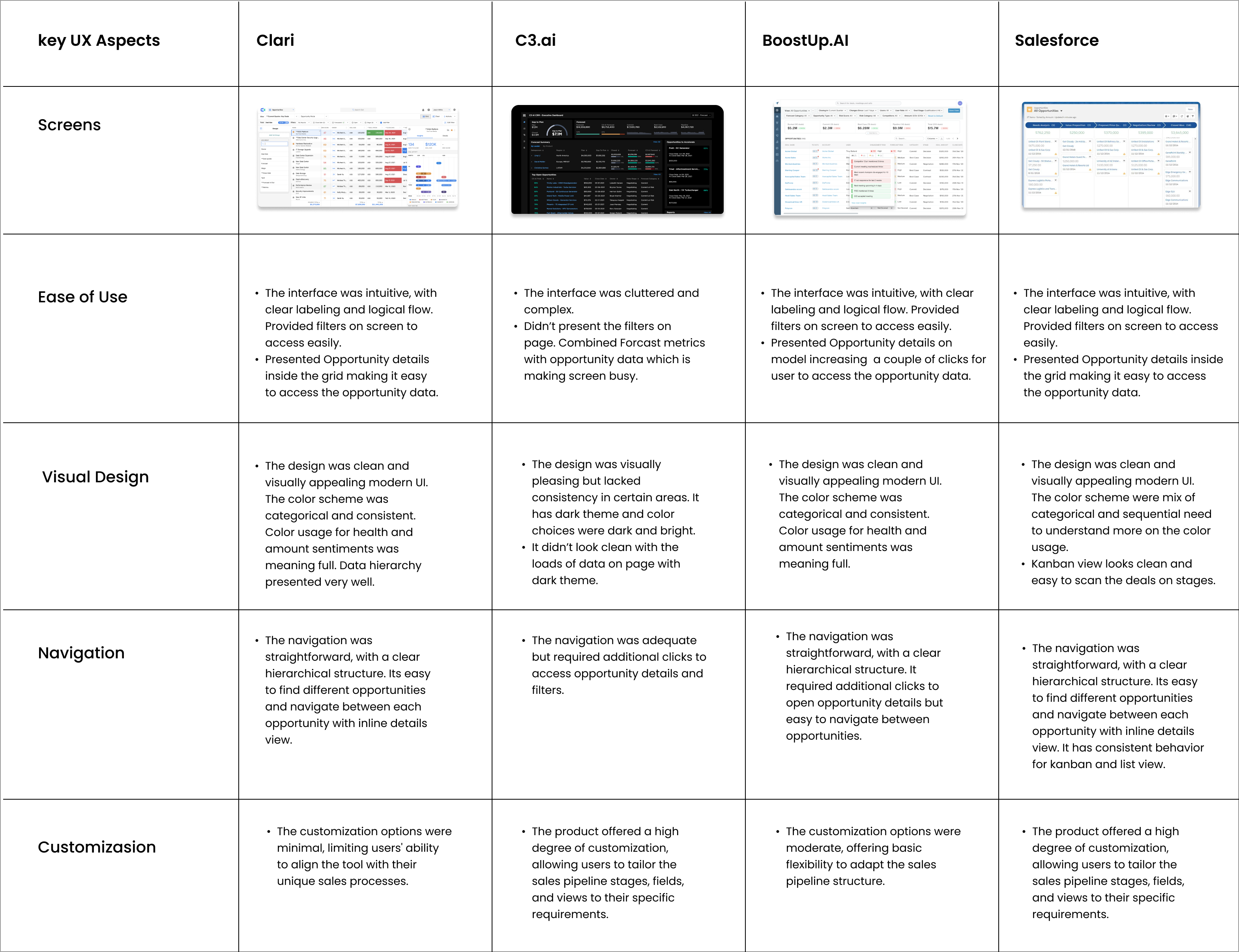
Competitive Analysis

The purpose of the analysis was to identify strengths and weaknesses of our competitors and to determine how we can improve our own Opportunity Pipeline UX. The analysis was conducted by examining the websites, product screenshots, and other marketing materials of five direct competitors. I also gathered the KPI insights from the marketing team to understand the Strengths and Gaps.

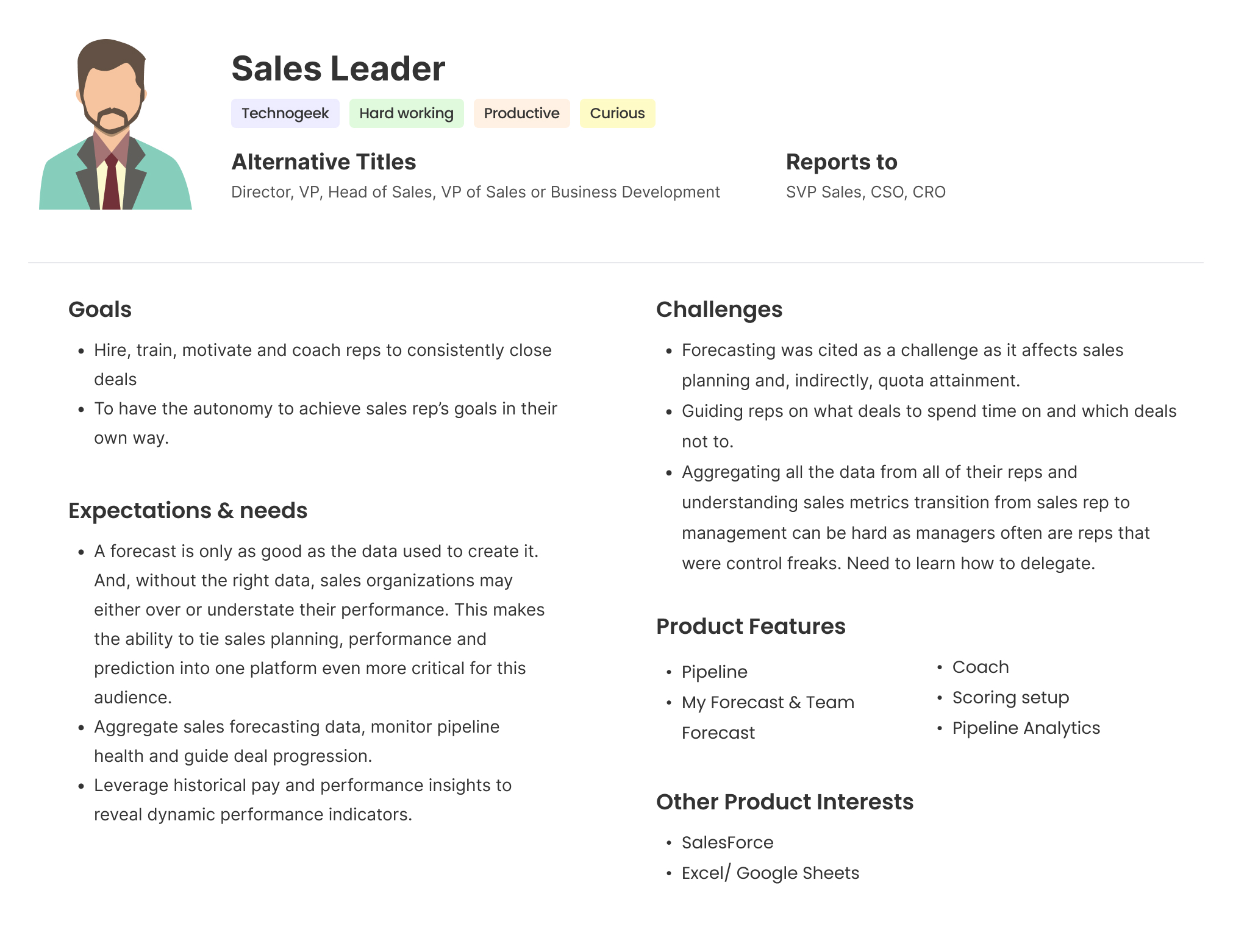
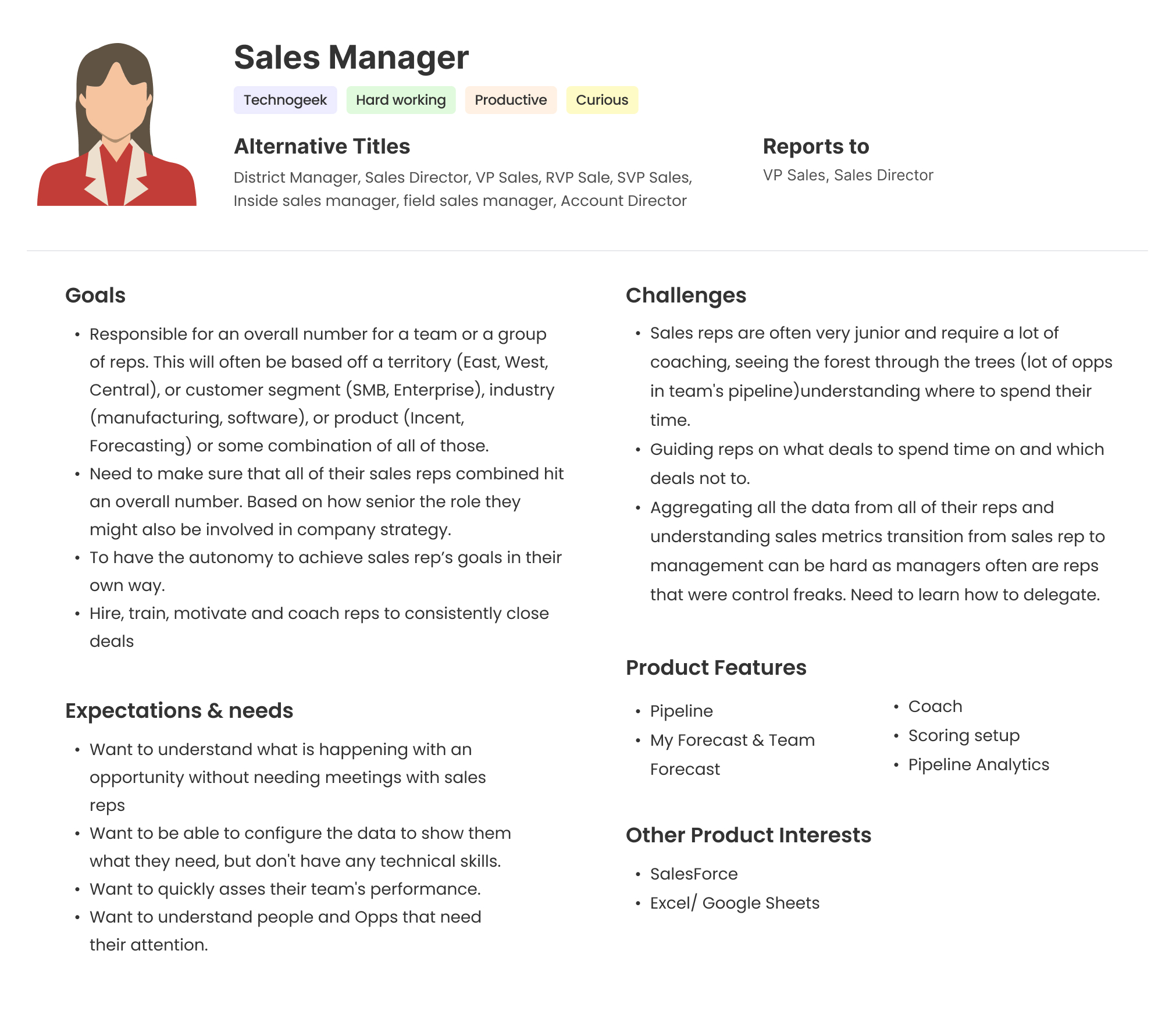
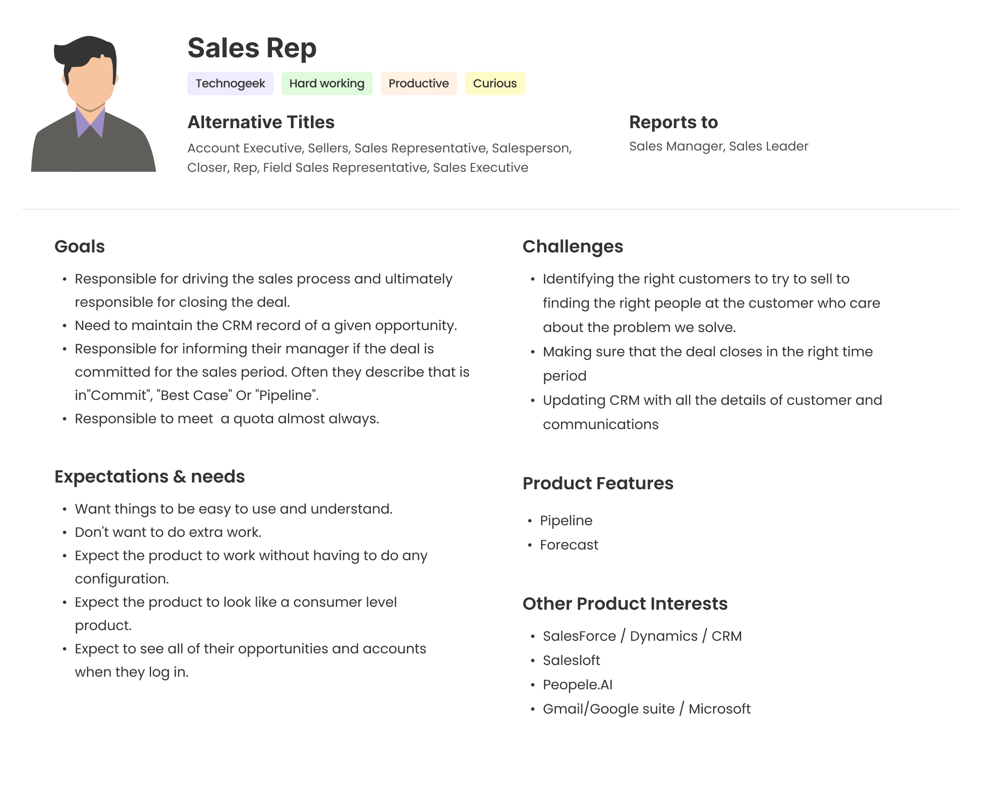
Personas

Due to the short timeline for the project, I quickly collected data from the marketing team to understand the goals and challenges of the buyer personas. Additionally, I gathered information from various product experts on user goals, expectations, and challenges.

Based on my research findings, I created the user personas that provided a comprehensive understanding of our target audience, their needs, and preferences.

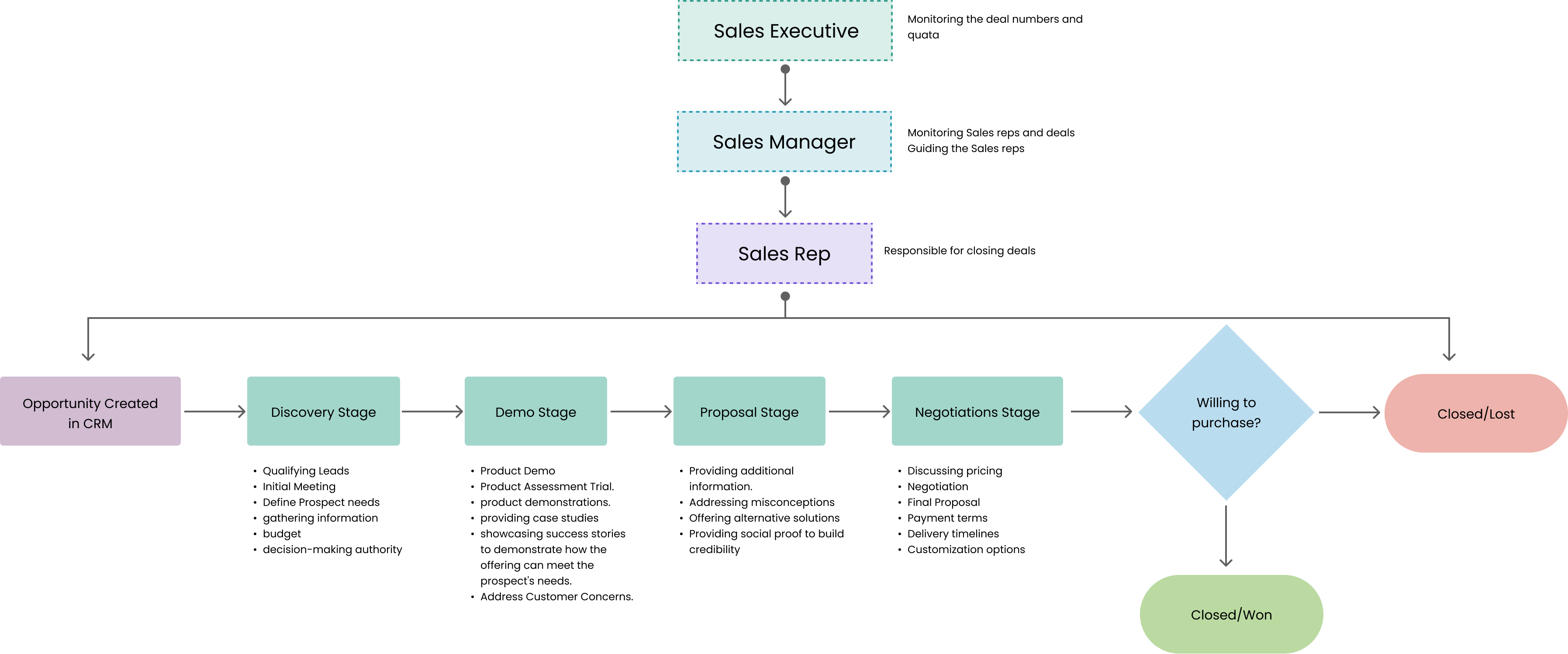
Personas Engagement in Pipeline Process

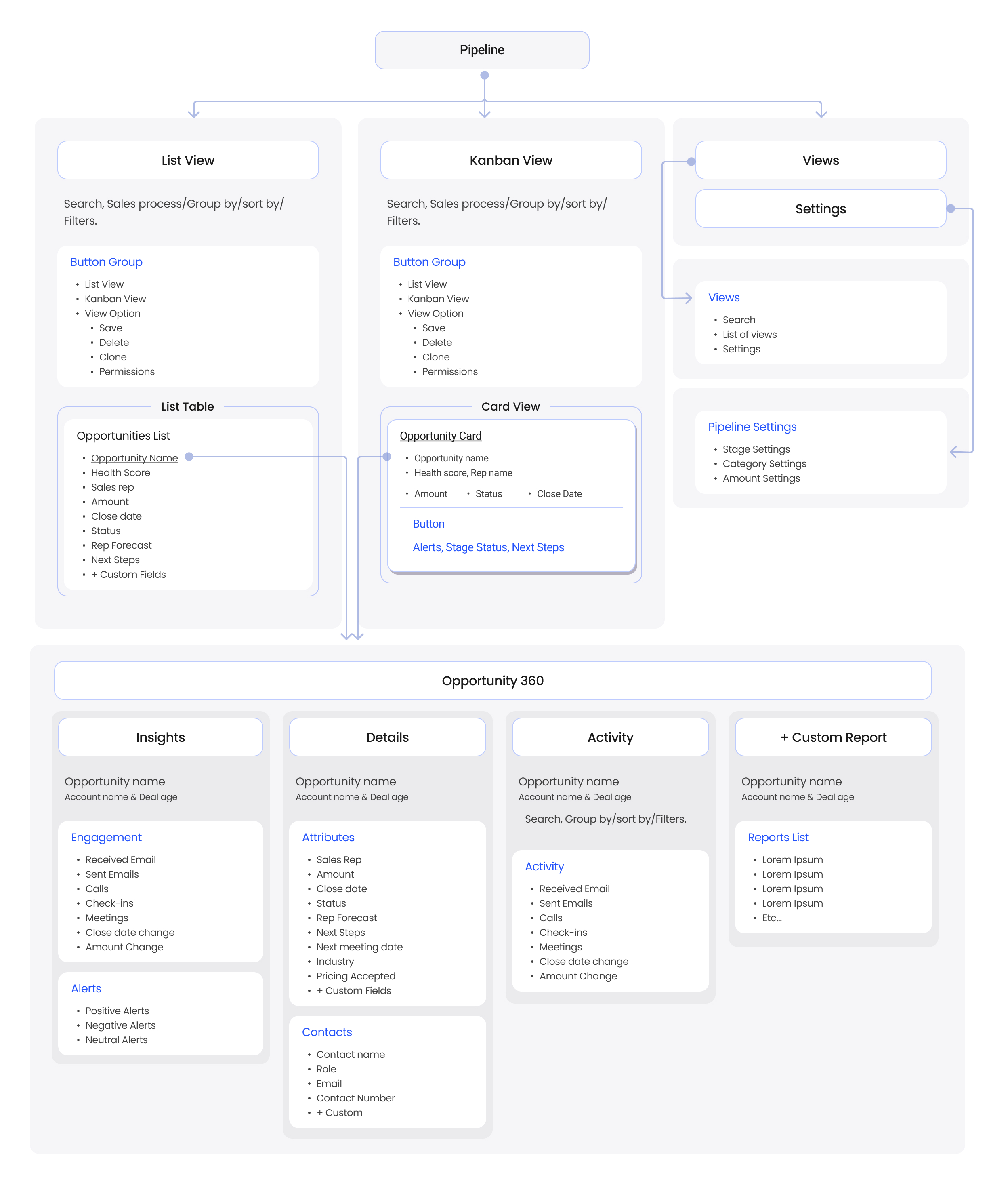
MVP  Features & IA

Based on my findings, I have conducted a workshop with stakeholders and engeneering team and defined the MVP for the sales pipeline management tool as follows:
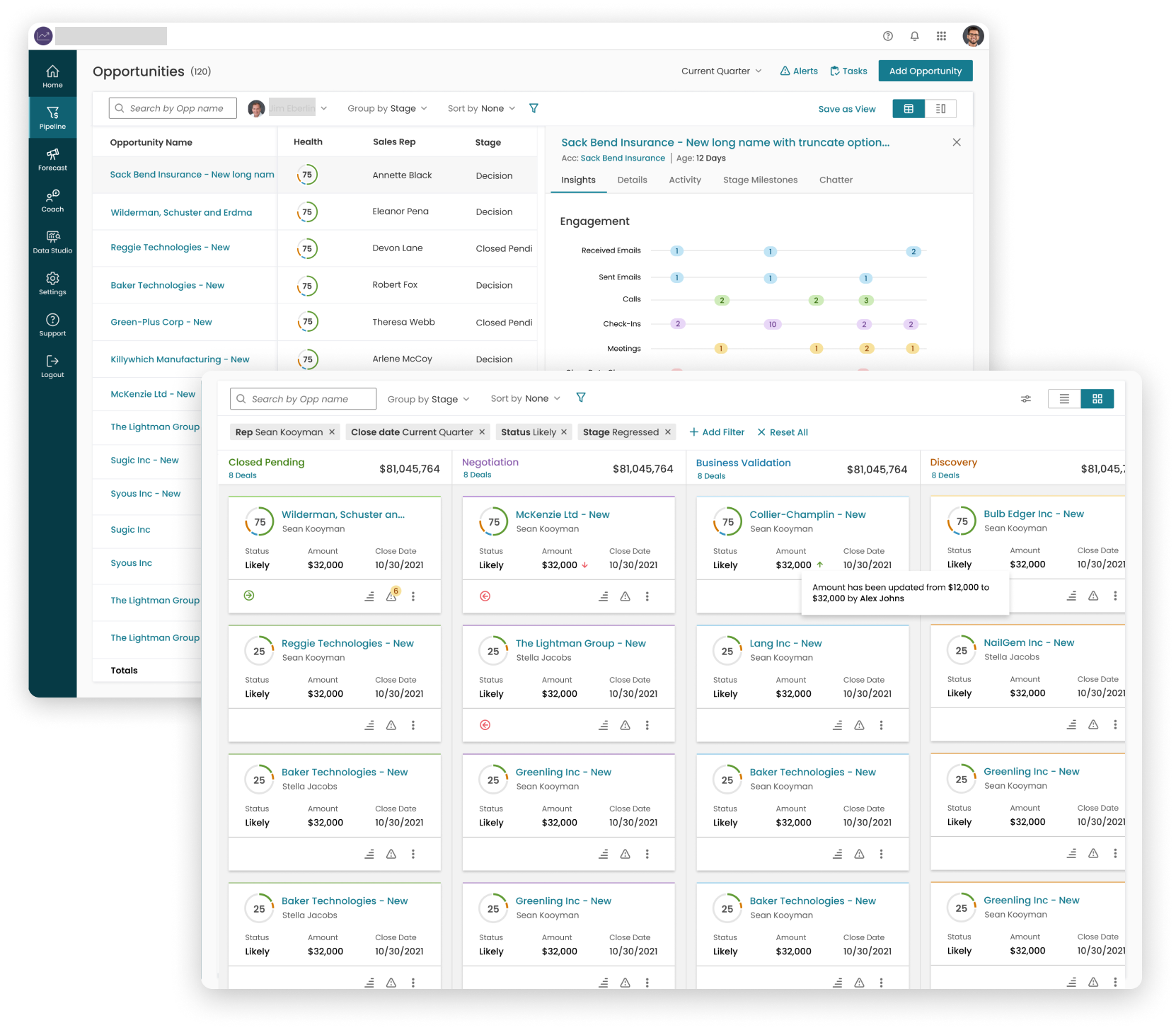
List View: A list view that displays the user's current pipeline, including the number of leads and deals at each stage with Inline edit.
Kanban view: A kanban view that displays the user's current pipeline, including the number of leads and deals at each stage.
Filters: Give an ability to Filters, Group and Sort the deals and support the saved views.
Opportunity Detail View: Provide Opportunity 360 view to quickly access the opportunity attribute and contacts data to make updates.
Opportunity Insights: Basic reporting functionality that allows users to view their sales performance metrics, such as number of deals closed and revenue generated.
Opportunity Activity: A sales activity tracking feature that allows users to track their sales activities, such as calls, emails, and meetings, and link them to specific leads and deals.
Defining the MVP for the sales pipeline management tool allowed us to prioritize features and deliver the most essential functionality within the limited timeframe and budget. This approach ensured that we were able to deliver a product that met the basic needs of our users and provided a foundation for future iterations and enhancements.
Wireframes

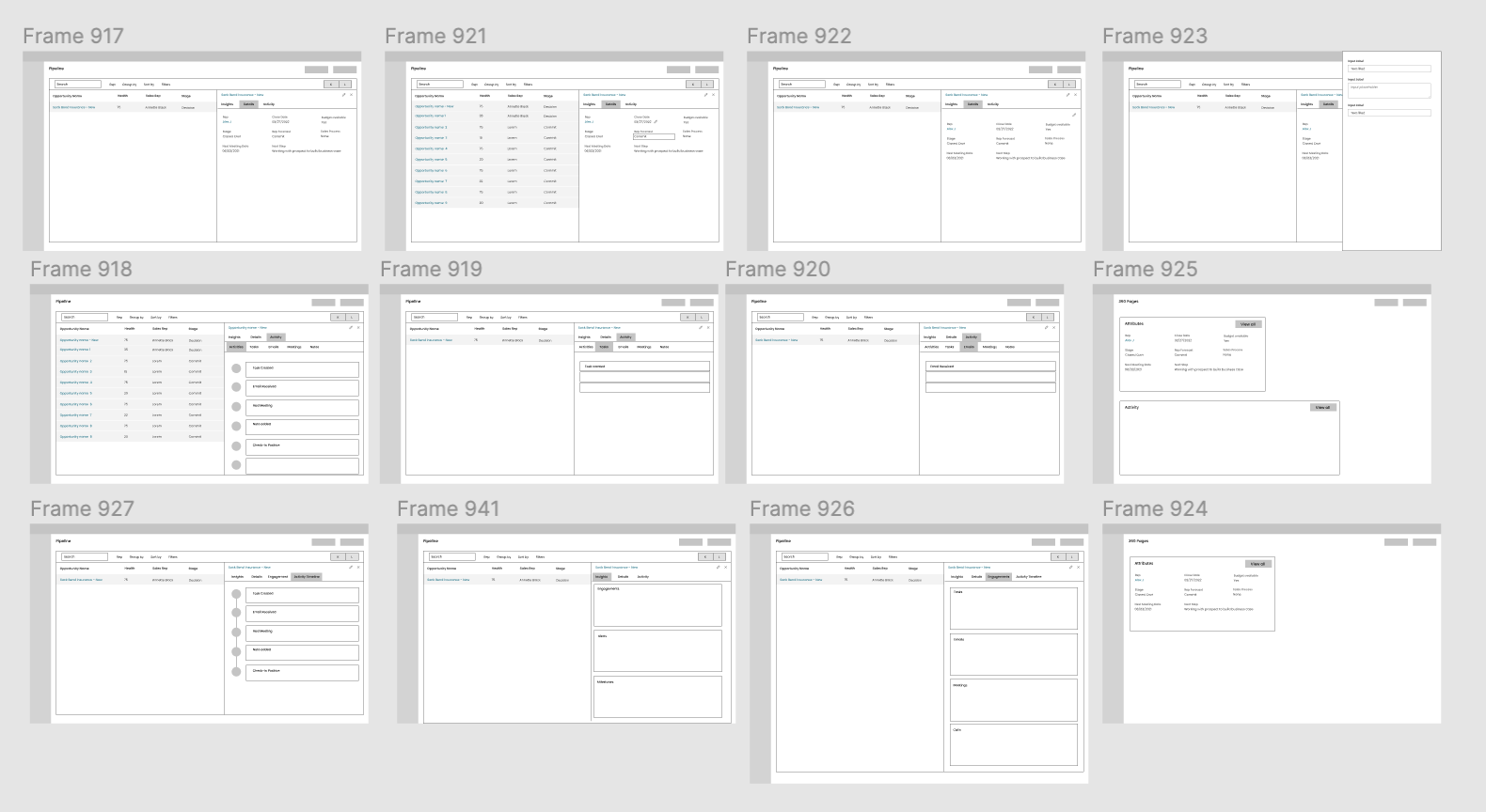
After Defining the MVP I have created wireframes of potential solutions to visualize and communicate the proposed ideas. Conducted a design review with team and gathered feedback on the proposed solutions. Used the feedback to refine the designs and ensure that they meet the needs and preferences of the target users.

Visual Designs & Prototype

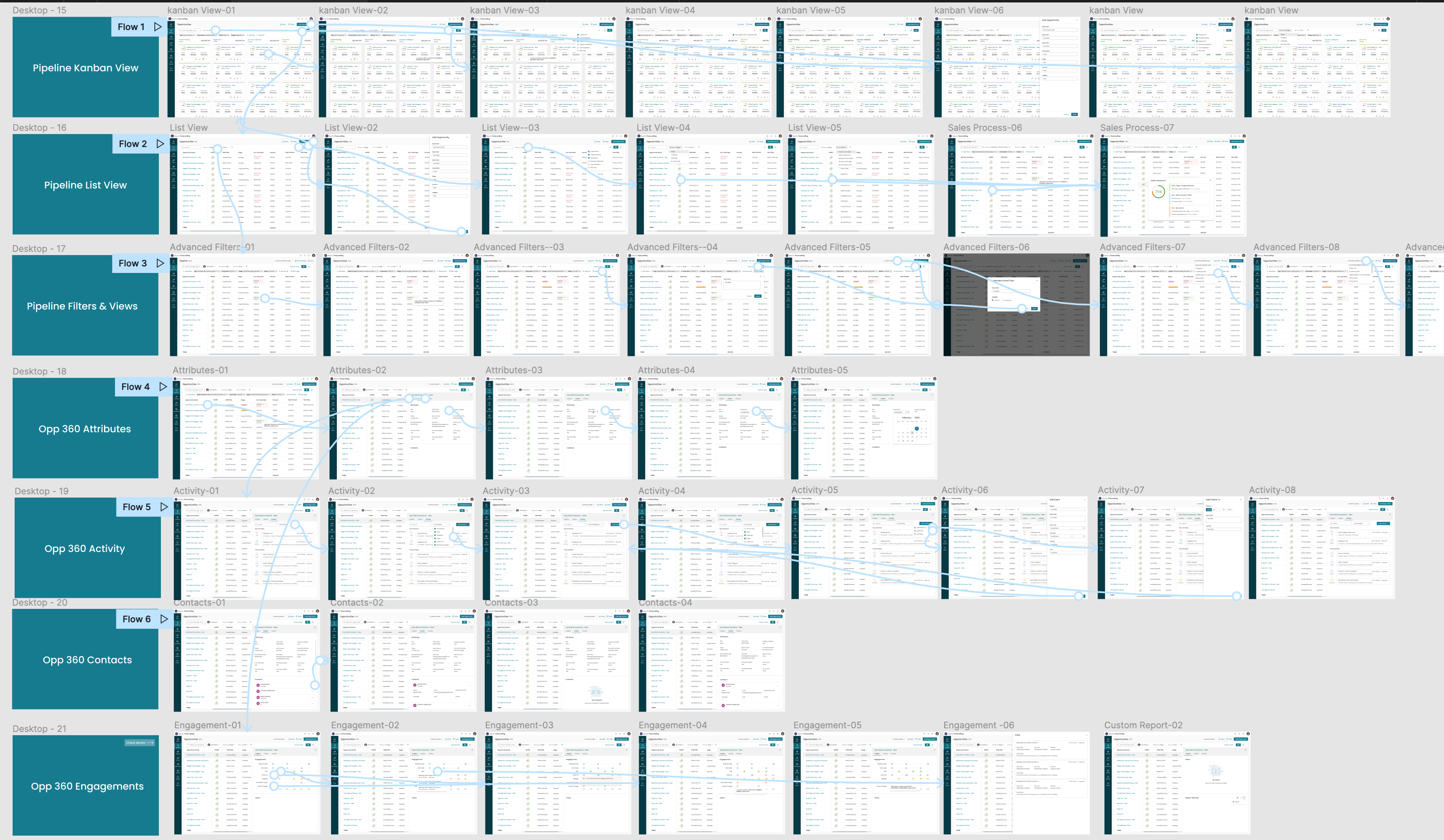
After finalizing the design concepts, I created high-fidelity visual designs by utilizing the design system components and developed new components as necessary. Additionally, I created a clickable prototype to demonstrate the interactions to the engineering team.

Developed Project

I worked very closely with the Front End team and conducted a UX review of each front-end ticket that was implemented to ensure it was aligned with the designs before it went live. You can see the final developed project below.

Validation Feedback

I collaborated with a researcher to validate the designs during the beta stage and collected feedback to improve them.
Positives
“Perfect! What I would expect”
Users like the current UI for Views and find it helpful.
Really like new release! Some new improvements like Inline edit list view and views.
Managers using this screen the most often.
“Views would be valuable to share, and easily save is great”
“This is good, better to have a library of views”
Improvements
“Simple to click in and consume or filter view (commit, best case)”

“Filters are confusing, filtering could see pipeline by stage/category”
Suggestions
[Reports] More visualizations including charts and graphs would be helpful

If colors are used in the design, they should represent information that is relevant to the sales users (for example, urgency, missing info = red)

Success Metrics

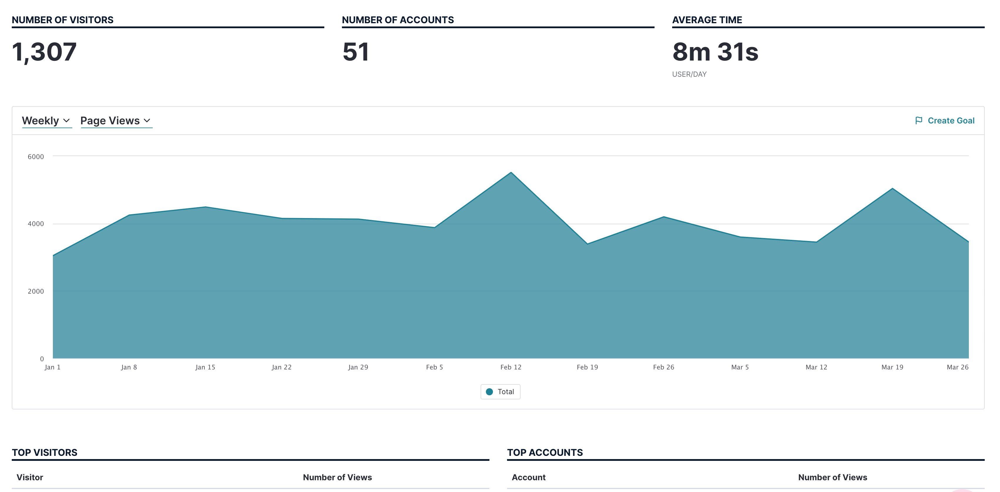
Following the release of the pipeline, we introduced several crucial features, including pipeline analytics and forecast 2.0. Over the next few quarters, I have analyzed the data collected through Pendo to gain deeper insights into user behavior and evaluate the feature's overall business impact.

Visitors-90 days

1,307

Average Time-User/Day

8m 22s

Accounts

51

Check Out Next Project

Data Visualisation Settings

Read Case Study

Password Required